In 2015, FutureBrand partnered with Merck Group on a brave and bold new identity that challenged the conventions of healthcare and life sciences.
10 years on, and relevant as ever, Design Week featured the rebrand as part of its Impact Series, which explores the enduring influence of the work a decade after its launch.
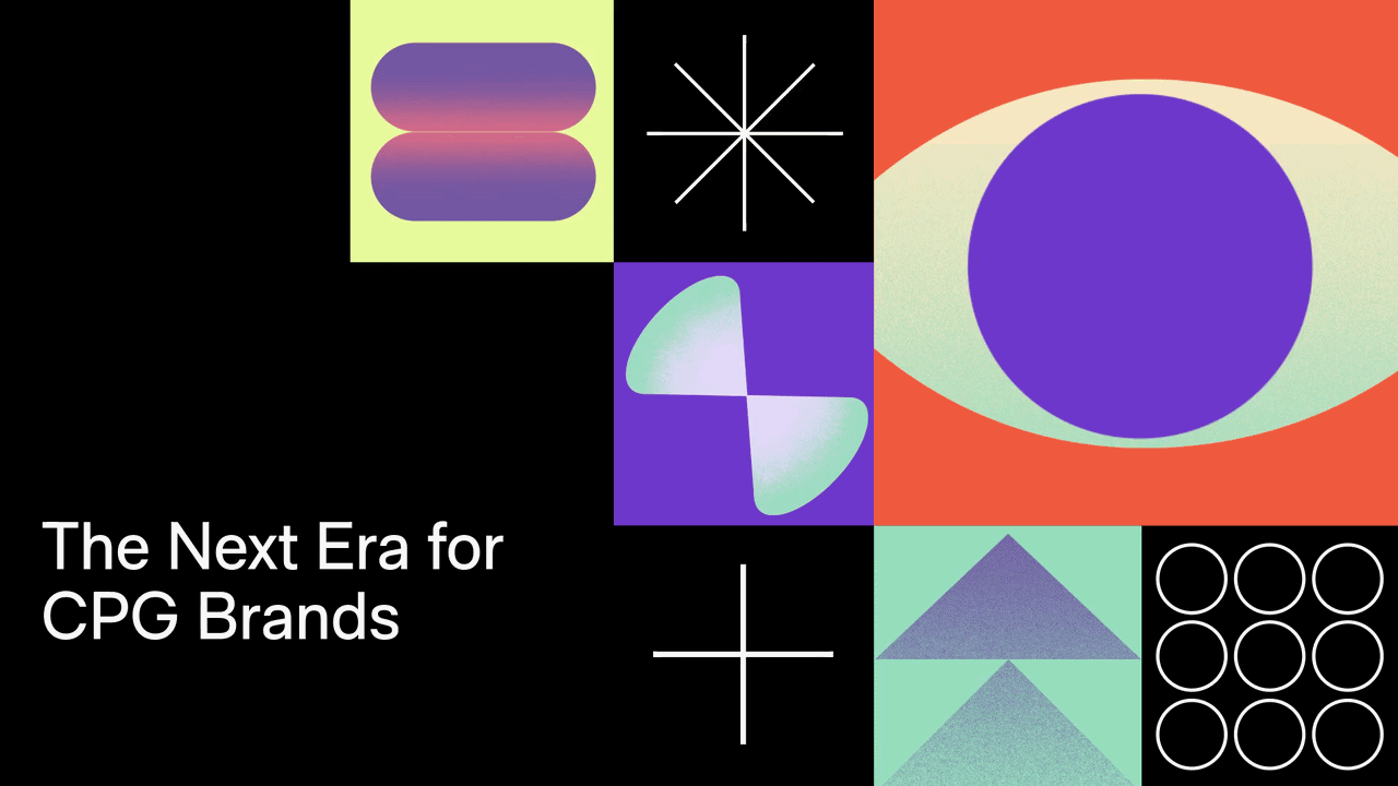
At the time, the sector was dominated by safe blues and greys. Hidden among a “sea of sameness”, Merck leadership knew they needed to throw industry caution to the wind.
Together with the team at Merck, including Axel Löber and Katrin Menne, we built a brand that expressed the vibrant, dynamic nature of science and technology.
The result was more than a new look: it transformed how Merck saw itself, gave employees a shared culture to rally behind, and reshaped how the world sees one of the industry’s most innovative players. A decade on, the identity still stands apart, proof that bravery, adaptability and craft can deliver lasting impact.
As highlighted in the article, the brand continues to inspire Merck’s people and partners today, showing how design can fuel culture as much as it shapes reputation.